Apa ukuran terbaik? Yaitu tingkat keterbacaan (readibility) alias mudah dibaca oleh pengunjung blog sehingga "ramah pengguna" (user friendly).
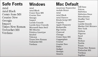
Jenis-Jenis Huruf yang Aman di Web
These are the four different types (or families) of Web Safe Fonts:
- serif
- sans serif
- fantasy or cursive
- monospace
Serif
Serif fonts are those fonts that have little hooks (or ‘Serifs’) on the end of letters. Some monitors don’t display these little hooks very well and they can become blurred or undistinguishable, particularly if the monitor has a low resolution.However, these prints are perfect for print so it is safe to use them in any online documents that are intended for downloading and printing.
Some examples of ‘serif’ fonts:
| Bookman Old Style | font-family: ‘Bookman Old Style’, serif; |
| Garamond | font-family: Garamond, serif; |
| Georgia | font-family: Georgia, serif; |
| Palatino Linotype, Book Antiqua | font-family: ‘Palatino Linotype’, ‘Book Antiqua’, Palatino, serif; |
| Times New Roman, Times | font-family: ‘Times New Roman’, Times, serif; |
Sans Serif
Sans Serif fonts do not have the little hooks or serifs on the end of the letters. These will display clearer, crisper and bolder on most monitor resolutions. This makes them easier to read and thus, the perfect choice for your blog.Some examples of ‘sans serif’ fonts:
| Arial, Helvetica | font-family: Arial, Helvetica, sans-serif; |
| Arial Black, Gadget | font-family: ‘Arial Black’, Gadget, sans-serif; |
| Impact, Charcoal | font-family: Impact, Charcoal, sans-serif; |
| MS Sans Serif, Geneva | font-family: ‘MS Sans Serif’, Geneva, sans-serif; |
| MS Serif, New York | font-family: ‘MS Serif’, ‘New York’, sans-serif; |
| Trebuchet MS, Helvetica | font-family: ‘Trebuchet MS’, Helvetica, sans-serif; |
| Verdana, Geneva | font-family: Verdana, Geneva, sans-serif; |
| Lucida Sans Unicode, Lucida Grande | font-family: ‘Lucida Sans Unicode’, ‘Lucida Grande’, sans-serif; |
| Tahoma, Geneva | font-family: Tahoma, Geneva, sans-serif; |
Fantasy or Cursive
These fonts are not widely available on computers and because they are ‘fancy’ and ‘cursive’ they can be very hard to read in large chunks. If you wish to use these you should restrict them to headings or use them in images.There is of course one exception, Comic Sans MS. This comes in at No. 9 on the list of most widely used and installed fonts and is easy to read and very popular.
Some example of fantasy or cursive fonts:
| Papyrus | font-family:Papyrus |
| Tempus Sans ITC | font-family: Tempus Sans ITC |
| Lucida Handwriting | font-family: lucidia handwriting, Lucidia sans |
| Monotype Corsiva | font-family: Monotype Corsiva |
| French Script MT | font-family: French Script MT |
| Goudy Stout | font-family: Goudy Stout |
| Script MT Bold | font-family: Script MT Bold |
| Comic Sans MS | font-family: ‘Comic Sans MS’, cursive; |
Monospace
Most web masters and developers use mono-space for code samples or instructions.It is as the name suggests, a font that has it’s letters evenly spaced. Monospace letters have the same width for each character, so they always take up the same amount of space, like a typewriter.
It is sometimes referred to as typewriter text. It’s not the most exciting font to use on your blog.
Some examples of monospace fonts:
| Courier | font-family: Courier, monospace; |
| Courier New, Courier | font-family: ‘Courier New’, Courier, monospace; |
| Lucida Console, Monaco | font-family: ‘Lucida Console’, Monaco, monospace; |
What size font should I choose?
This is definitely up for discussion. Many people believe that 16 pixels should be the ideal font size. Personally I think a font size of 14 pixels is perfectly big enough. If you are writing a blog specifically for a target audience that may have issues with reading a smaller print then, knock yourself out, and use 16 pixels or bigger, otherwise I think you are safe with 14 pixels. But just be aware that different fonts look different sizes sometimes with the same font size.So what’s the best font to use for your blog?
It’s an important decision and you should weigh up your personal choice with the following rules to help you choose the best font to use for your blog:- Sans serif for online, Serif for print (or downloadable documents intended for printing)
- Keep fancy fonts to a minimum and limit to headings and accents.
- Don’t use more than 2-3 fonts on any one page.
- Don’t change fonts in the middle of a sentence without a very good reason.
- Don’t use more than 3-4 fonts on any one page.
- Don’t change the font in mid sentence unless you have a very good reason.
- Sans serif for online, serif for print.
- Monospace for typewriter and code
- Script and Fantasy for accents only.


0 Komentar untuk "Jenis Huruf Terbaik untuk Blog (Website): Sans Serif!"